[dropcap style=”font-size: 55px; color: cyan;”]E[/dropcap]ver since I was a little boy, I’ve followed the (mis)adventures of the San Francisco Giants. My father took me to my first baseball game when I was in the first grade, about six months or so after my first San Francisco 49ers game. When I was that young, I think being able to take off from school to go do something with your dad that didn’t involve a doctor or dentist appointment was pretty special. I remember the atmosphere was different from a football game, but being able to ride up what was the longest escalator I’d ever been on in my life up until that point to the upper deck behind home plate thrilled me all the same. My dad taught me what he knew about the game, and I honestly couldn’t tell you what he was saying because it was really loud and I was in over my head with the action on the field and the reaction of the crowd.
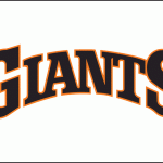
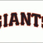
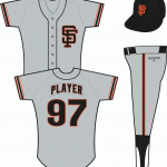
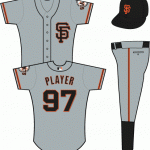
Over time, the more time he and I spent watching the Giants (of both San Francisco and San Jose), he taught me about the game that I would eventually follow closely. I was taken with all aspects of Giants baseball, from Candlestick Park and the way the wind seem to swirl around the bowl, right down to the uniforms. For some reason, I was fascinated by uniform design and as I got older, when the uniforms changed, I always thought it was really cool to kind of see the directions in which the teams would go. In 1982-1983, the Giants had introduced a new uniform that switched from the familiar script to a block/small caps logo, and their road uniforms were a simple copy of the cap logo, the intertwined SF they’d been wearing since their move from New York in 1958. In these uniforms, they would win the NL West division twice (1987, 1989), and the NL pennant once (1989), and they were the first uniforms I’d ever see the Giants wear in the acolyte phase of my baseball fandom.
In 1994, the Giants returned to the classic old-style lettering that they used from 1947 in their move west. It was awesome, and conveyed the maturity of the franchise. The cap logo also received a classical treatment, as they added serifs to the SF. I loved it. The feeling of watching the team in the older-type uniforms was that of watching a team back in the Golden Age or something, even though it was the mid-1990s. They got a bit of an adjustment in 2000 when the team departed the Stick for Pacific Bell Park, but ever since they’ve been the same uniforms. We’ve seen some pretty cool alternate and special event uniforms arise since then as well; my favorite is the Hispanic Heritage uniforms with the block “Gigantes” on the front. The team has a .950 win percentage in those uniforms. I’m not fond of the Orange Friday alternate home uniforms, which sometimes reminds me of a CalTrans crew working those late nights on I-5, and the stadium turns into a giant construction zone with the heavy orange-colored attire everywhere. I do own an orange Giants tee for games that land on Orange Friday, but I tend wear it under my black dugout jacket and my cream-colored home jersey from their 50th anniversary in San Francisco.
Anyway, last night, I was looking through SportsLogos.net for Giants logos I could transfer to my iPhone. Spring Training begins in less than a month and I’m already kind of hurting for some baseball. While I was there looking through the logo gallery, I happened to notice that there was a new entry to the list with specific notation of a new alternate road uniform. When I looked at it closely, I was instantly brought back to my childhood. I talked with Julia about it and she said these aren’t officially announced, but SportsLogos.net is pretty good about maintaining their site integrity, so I don’t know if this is a rumored/proposed uniform design or if SportsLogos has some inside information (that site is nothing except logo/graphic design and design news for all sports teams on the planet). Regardless, if the Giants are intended to wear these, I’m looking forward to seeing them in action, again. Take a look (click on the images to see them in their full view) and compare the two uniforms, because I think this is an awesome move by the Giants.
I don’t think I would be equally thrilled to see the old 80s block Giants uniforms, and given that these are going to be alternate road uniforms, that means they will be in occasional use outside of the current road uniform with the block “San Francisco” on the front.
I’m sure it seems like I’ve gone on enough about my fascination with baseball uniforms. Maybe, one of these days, I’ll share some of my designs for some of the fictional baseball teams that I’ve written about in the past.


